You're all ready to start advertising on Facebook. You've selected the type of ads you want to run. You've thought of a good headline. But you just...need...to...figure out...a great image. There's so many options but, how do I know what works for me? The truth is, you won't. Or, more specifically, you won't know the best option until you test several variations. There are some great, helpful studies to be found about what types of images get the most engagement, but when you're advertising on Facebook, you're going to want to test, test and test again. Not to worry though. I've managed hundreds of thousands of dollars in Facebook advertising spend and have found success with a number of different types of ads. I'm going share with you some Facebook advertising examples that you can take and use to help your SaaS cost per acquisition go as low as possible.
Facebook advertising examples: The straight-into-the-camera single-human image.

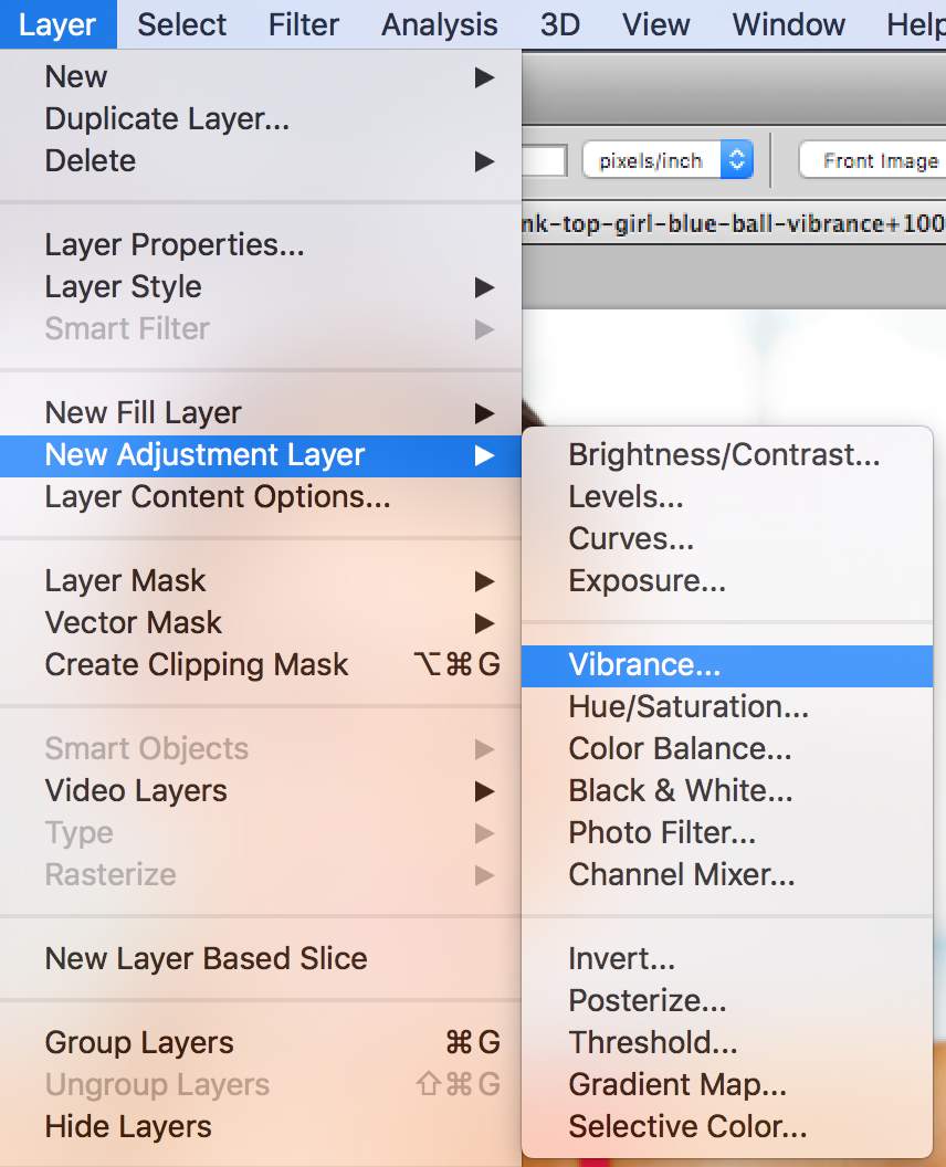
This image has worked well for me for two reasons: 1) The girl is pretty far zoomed-in-on. You can clearly see her face. 2) the red and blue colors are eye catching. They contrast nicely with the muted, clear background of the studio setting. When advertising on Facebook, color contrast can have a drastic impact. Tip: What you can do in Photoshop to make the color pop even more is to add an adjustment layer to increase the vibrance, hue, saturation, or sometimes all three.
How to Add Adjustment Layer in Photoshop:

The Colorful Background Color with Content Above The CTA

Sometimes it's the solidarity of the color of an image that can be effective. Here there's a pretty clear offer, an eBook, with a clear call-to-action, download. When advertising on Facebook, try testing versions of this add with the button enabled and without. On the landing page, be sure to include the same image, the cover of the eBook, on the form submission page. Want to test different variations of this ad? Try flopping the download button with the image of the eBook, or try lowering and centering the copy so that it's in line with the CTA button. With the right A/B testing and well-managed Facebook ads management and optimization, you should be able to hone in on the best performing ad variants without trouble.
Using the subject in the image to draw attention to your product
Here's a pretty basic image: 
Just a woman performing a plank, staring at an empty space. There's not much color that stands out; the entire photo is pretty gray. But...with some adjustments, you can create this: 
This was a top performing Facebook ad for us. It can be hard to find images with as much great open space as this one. But, when we did, we put a collection of product shots in there. Now it looks like the woman is looking right at it. She attracts the attention, but her gaze sends your view to the product. Not only did we combine product shots with a stock image, but we added an adjustment layer to better bring out the woman's skin tone. The last and maybe most significant, subtlety of this image the layer between the stock photo and product image. The layer is set to go from dark to light, and the opacity is reduced by about 75%. Why did we do this? We wanted the color of the woman's skin tone to come out, but we didn't want the product image to get lost in the similarly-colored background. By adding a layer that improves the contrast on one side and weakens it on the other, we found a solution for both. Through process-intensive, dilligent A/B testing, we realized device tipe was a significant factor in ad performance and conversion rate.
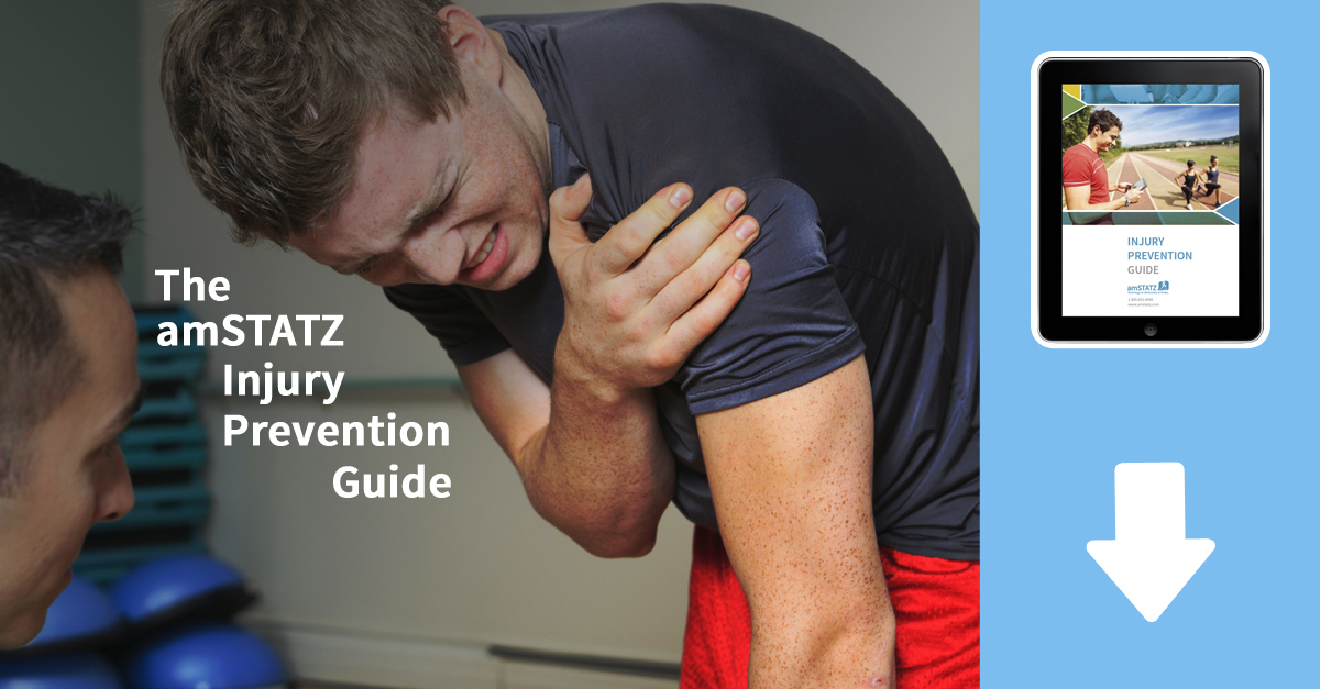
The Not-So-Subtle "Download This eBook" Image

This image contains some of the same adjustments we used on the other images, namely the adjustment layer for more vibrance to bring out the red, then a gradient layer between the stock image and the copy to help the copy "pop" off the screen a bit more. But the change we made here was to add a prominent color bar to the right hand side of the image, with an image of the eBook within it. We also went with an arrow which was aligned directly over the "Download" button. If you're going to do a lot of advertising on Facebook you'll want to create some ads for your own vertical, and be sure and test test test. Lastly, pay close attention to all the different variables involved.


